Data Controls
Description
Data Controls are controls used to create interfaces for manipulating and editing data from a data source (e.g. SQL database, web service, static data, etc.)
Discussion
A Data Control is an interface, such as a TextBox or DropdownBox, that can be used to display and/or edit data from a data source (database, web service, etc.) The control in the UX Component is either generated as an HTML input control or as a more complex control - such as the List control - that contains multiple elements (toolbars, buttons, a custom client-side layout, etc) that can be used to interact with the data.
- Name
- Description
- AdvancedListSearch
Adds the ability to search a List control with a highly-configurable interface that lets the user add and remove fields from the search criteria.
- AudioPlayer
The AudioPlayer control allows you to add a control to the UX to play audio files. Rich Data Capture.
- AudioRecorderAndPlayer Control
The AudioRecorderAndPlayer control allows you to add a control to the UX component to play audio files and to record audio files in Cordova applications. Rich Data Capture.
- Button List
The Button List displays a series of buttons in either a vertical or horizontal orientation.
- Calendar
Adds a calander to a component. The days of the week and the format of the calendar can be adjusted using the calendar's control properties and the settings in the '[Other Properties]' section of the UX Properties page.
- Chart
A control for adding server-side Charts to a UX Component.
- CheckBox
The CheckBox control can be used to add checkboxes to an application. Multiple checkboxes can be specified as a single CheckBox control.
- CheckBoxList Control
Displays a list of checkboxes. Choices can be filtered and sorted.
- CustomControl
Data Bound Custom Controls are a powerful technique for creating custom controls on a UX component.
- DropdownBox
The drop-down box control resembles the textbox control except that it has a button next to it. When a user clicks on a button, a list of choices are displayed. After user selects one of the choices, the selected value is used to fill in the drop-down. The choices defined for a drop-down control can be static, dynamic, or based on a variable.
- Enter Code Control
An interface for entering a two-factor authentication code that provides animated feedback when the code is incorrect.
- ExpandingMenu
Displays a list of menu items. Menus can have sub-menus. Sub-menus are animated into view when expanded.
- Hidden
Adds a hidden control to a component. The control itself can not be seen by users. Hidden controls can be used to pass values to other parts of an application. For example, they can be used in connection with Server-side action-scripting to assign a group to a new user when the user creates a username and password.
- Image - Data Bound
Places a data-bound image control on the component. Data-bound means that the image data it tied, or bound, to a server-side database. The images on the server can then be used to populate the image data displayed on a client-side device, like a mobile phone. Images that are not data-bound can be add to a component using the [Image] control in the other controls section.
- Ink
The ink control allows users to enter drawn data into a database and annotate images.
- IntegerValue
This control is used for a field that only allow integer values and the value can be set by clicking buttons to increment/decrement the integer value. The integer value control makes it easy for users to select an integer that can then be used to set the value of another control inside a component.
- Label
Places a stand-alone label on the component. Most controls also come with their own label.
- List Control
Information about the List Control.
- Map Control
Inserts a map control into a UX component.
- Multi-select Token Control
The Multi-select Token control is a dropdown control with an auto-complete list that inserts tokens that can be removed by clicking an 'x' button on the token or using the delete or backspace key on the keyboard.
- QRCode
Quick Response Codes or QR codes are optical labels that contain data and that can be added to documents and/or websites. A device equipped with imaging capabilities, like a smart-phone camera, can then be used to access the information contained within these labels. One advantage to using QR Codes is that they have the ability to store a large amount of information about something in a very small space. Because they are machine readable, this information can be used by devices to side-step tasks that would take the users of an application considerable time to deal with. For example, a QR Code can contain a long URL which, when photographed using a phone, will automatically take users to a website; without the user typing in the URL. QR Codes are used extensively in tracking, product identification, and marketing.
- RadioButton
Radio button controls can make it easy for users of an application to quickly select items in a list. The size and appearance of radio controls can be modified easily using the Custom Appearance Designer and CSS.
- SemiCircularNumberDisplay Control
The SemiCircularNumberDisplay control can be used to display numeric data as a semi-circular chart.
- SemiCircularNumberDisplay2 Control
The SemiCircularNumberDisplay2 control can be used to display numeric data as a semi-circular chart.
- Signature Capture control
The Signature Capture control is used to capture a signature in an application.
- Slider
The Slider Control can be used to set the value of either a single control or two controls (e.g. start and end values.)
- Spin List
The Spin List control allows the user to select from a pre-defined list of choices by swiping the control to 'spin' the list. The item the list stops on is the selected item. This is an ideal control for mobile applications because it is 'touch friendly'.
- SpreadsheetInput Control
Displays a spreadsheet style grid for editing values.
- StarRating
Star Ratings are a common way to add input.
- StepIndicator
The Step Indicator control is used to show what step a user is on in a multi-step action.
- Switch
Switch controls allow users to turn settings in an application on and off with the tap of a finger.
- Text Area
'Text Area' controls provide a large area where users of an application can write.
- TextBox
TextBox controls provide an means to create new text that can be entered into other controls, such as a list control. Through its 'Lookup' properties, in the control properties list, a Textbox can also be used to create Edit-Combo boxes that display a list of choices that users can select from. You can also add buttons to a textbox that will allow you to clear entered data, search for entries in a list, filter a list, or run some customized javascript code or action.
- Tree
Tree Controls are useful for organizing sibling and child items. This section looks at populating tree controls using Ajax and Javascript.
- VideoPlayer
Adds a data-bound VideoPlayer control to a component.
- VideoRecorderPlayer
Adds a data-bound Video Player control to a component that can be used to play and record videos. The VideoRecorderPlayer can only be used in Cordova applications.
- ViewBox Control
The ViewBox is a control that displays hot HTML. The HTML can either be statically defined or dynamically defined using an HTML Template.
Working with Data Controls in Javascript
Javascript can be written to interact with a Data Control programmatically. This is done by calling methods on the UX Component object, which is represented in your javascript code using the {dialog.object} placeholder object. The following methods can be used to interact with Data Controls (click the method name for additional information):
- UX Method
- Description
- getValue
Get the current value of the Data Control. Works with all Data Controls.
- setValue
Set the current value of the Data Control. Works with all Data Controls.
- setValueFrom
Sets the value in a target control with the value from a source control. This is the equivallent of calling getValue to get the value from one Data Control and then calling setValue to set the value in another Data Control. Works with all Data Controls.
- setControlDisplay
Show or hide the Data Control.
- setDisabled
Enable or disable the Data Control.
- setFocus
Set the focus to the Data Control.
- getPointer
Get a pointer to the DOM element for the Data Control.
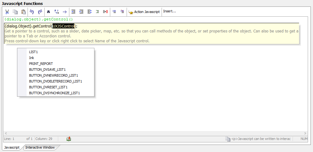
- getControl
Get a Javascript object for the Data Control that can be used to perform more complex operations or access/manipulate the Data Control's settings. This method is only available for more complex controls, such as a Slider, Date Picker, Map, List, ViewBox, etc. Basic controls, such as a TextBox or Label, do not have Javascript objects.
The methods above are not limited to Data Controls. Other controls can also be manipulated by these methods, however not every control is supported by all methods. For example, controls that do not have a value, such as a Container, cannot be used with the getValue or setValue methods.
Alpha Anywhere's popup help for javascript functions includes access to menus and builders that can be used to help write javascript code. If you are unsure if a control can be used with a method, the popup help for some methods includes the ability to display a list of IDs for the supported controls available in the UX Component.